Monday, February 22
BlogPost for Friday the 19th
Chapter 13 Questions & Answers:
1. Identify and describe the 6 principles of design.
The 6 principles of design are;
Rhythm - is repitition. Rhythm occurs when a certain element is repeated. Rhythm can add movement to a design, looks like something is happening.
Balance - an impression of steadiness created by placing all the elements of a design in a certain way.
Proportion - the size relationship of one part of a design to another.
Variety - difference; adds interest and excitement to a graphic design.
Emphasis - making one element in a design stand out.
Harmony -the effect achieved when the various elements of a message design work well together.
2. What are the six major styles of type?
The six major styles of type are roman, square serif, sans serif, text, script and novelty.
3. Name the elements of design.
The elements of design are line, shape, form, space, color, texture amd shades of dark and light.
4. What type style is used for the text in most textbooks? Why?
The type style used for text in most textbooks is roman because it's the easiest to read.
5. How is the point size of a typeface determined?
The point size of a typeface is determined through the printer.
6. Name and describe the three kinds of sketches produced during the graphic design process.
Thumbnail layout - small, quick sketches drawn to try out ideas and show how something might look.
Rough layout - contains all the information a printer needs to produce a final product.
comprehensive layout - full color layout that shows how a product will look after it has been printed.
7. Tell the difference between line art and continuous-tone images.
Line art illustrations are made up of solid, dark lines and shapes drawn on a white surface. Continuous -tone images are illustrations composed of varying shades of gray. Black and white photographs are a form of continuous-tone images.
Tuesday, February 9
Blogpost for Friday the 12th
A poster should;
- Have large type that can be read from the expected viewing distance (normally 10-15 times your format width).
- Have a simple layout (select a few key elements - type and visuals - so the viewer quickly gets the message).
- Include all important information: date, time, place, etc.
- Have one dominant element - a headline, visual or logotype - that will quickly attract the eye.
- Have the most important message emphasized by size, color, or value.
- Have art that is closely related to its message or subject.
- Have its type and visuals arranged in logical sequence (should read from left to right or top to bottom).
- Often have unusual or tight croppings on photos (tightly cropped photo can be reproduced larger, so it's easier to see).
- Have bold, intense colors so it can be easily seen at a distance (poster is meant be seen only at a close range can have more subtle colors).
PRINCIPLES OF DESIGN:
Balance - visual balance comes from arranging elements on the page so that not one section is heavier than the other. Or, a designer may intentionally throw elements out of balance to create tension or a certain mood.
Proximity / Unity - how close together or far apart elements are placed suggests a relationship (or lack of) between otherwise disparate parts. Unity is also achieved by using a third element to connect distant parts.
Alignment - how you align type and graphics on a page and in relation to each other can make your layout easier or more difficult to read, foster familiarity, or bring excitement to a stale design.
Repetition / Consistency - repeating design elements and consistent use of type and graphics styles within a document shows a reader where to go and helps them navigate your designs and layouts safely.
Contrast - in design, big and small elements, black and white text, squares and circles, can all create contrast in design.
White Space - designs that try to cram too much text and graphics onto the page are uncomfortable and may be impossible to read. White space gives your design breathing room.
Friday, February 5
First Friday BLOG post -

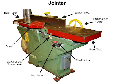
After we print this our on coral in black & white, and Mr. Vye will label the parts for us. Then we will have to edit the picture again labelling the parts for a good copy.
Monday, February 1
'Can The Web Save Papers' - Opinion Post
You don't have to go out to the store in the cold weather or rainy weather. Even during a storm you wouldn't have to worry about going out. Going out means you might get a paper or just miss the last one. You can just open up your iSlate and buy the paper online.
Instead of wasting paper on some of the articles you don't read, like the sports, you can just skip it on your iSlate. Less harmful for the environment again.
The more iSlates mean less papers used to print in factories. Also means less pollution coming from the factories. Instead of people littering their papers on the sidewalks or benches, they'll use their iSlate.
I think this device will save a lot of paper and save the environment more, but should also be concerned about hackers and viruses that may attack these pages.