Sunday, March 28

Blogpost for Friday the 26th;

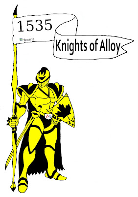
This week in CommTech I finished my Knight Of Alloy picture. It looks like this;


I also created two buttons. One school related and one of a favorite quote. They look like;


We also received a small opinion work sheet. It's about a girl who uses her interest in photography, fashion, and her education in english to create a blog. The questions that went along with the assignment about the article are;

Will she be successful in her blogging quest to build a career?
I think Yarhi will be successful in her blogging quest to build a career because both her parents work in film and she has been noticed by many people.
Is a blog a good avenue to use as a portfolio of your abilities?
A blog is a good avenue to use as a portfolio for your abilities because it is worldwide and many people use the net and blogs. I think that if you use a blog you should also copyright your images and such so no one can steal them.
Why did she create a blog?
Yarhi created a blog to showcase her writing and her photography as well as spotlight what she believed was Toronto's colourful but largely overlooked world of street fashion.
Has the blog opened doors for her?
The blog has opened doors for her because she was profiled in shopping magazine Loulou. Much Music produced a three minute segment on her as a street photographer, which led to a gig as the station's correspondent for Toronto Fashion Week. Elle Canada hired her to do street style photo shoots, and her reputation came to the attention of editors at the alternative weekly, NOW.
How does she promote her blog?
She promotes her blog by publishing it to the world on the internet for everyone to see.

Wednesday, March 10

Blogpost for Thursday the 11th!

This week in CommTech we received a booklet for our independent projects. It tells us how what we're suppose to do; design brief and report. The project areas we can do are;
- photography (black and white 35mm on display),
- photography (digital on yearbook spread),
- multi media (interactive tour of Korah),
- video (editing),
- animation (stop motion, computer animation),
- screen printing (adobe illustrator),
- desktop publishing (school newsletter, yearbook spread),
- web page design (HTML, dreamweaver),
- audio visual (presentations slideshow, irfanview), and
- display (for display cabinet).
We also received out updated marks and I currently have a 70, and I am not ecstatic about it. This week I have also worked on the robotics logo still, and started to work on screenprinting designs.

Friday, March 5

Blogpost for Friday the 5th --

This week in CommTech we worked on our posters and slideshow. We also did a Principles of design quiz this wednesday. We are also working on a Robotics logo. We're editting a scanned picture, and editting it on photoshop. I am having no problems with it so far.
Today we received a Digitial Terms sheet with terms for our next wednesday quiz. They are;

Resolution - The number of pixels in an image.
Pixel - (PICture ELement) The smallest element of a digitized image.
Megapixel - A unit equal to one million pixels.
PPI - Pixels Per Inch; the number of pixels per inch.
Megabyte - Computer memory consisting of about one million bytes.
Kilobyte - Computer memory consisting of about one thousand bytes.
Byte - Eight bits of computer data.
Bit - A tiny amount of computer data.
JPEG - Joint Photographic Experts Group.
LCD - Liquid Crystal Display.
Memory Card - A storage device used to store data.
Digitize - To convert analog information into digital format.
Gigabyte - Computer memory consisting of one billion bytes.

Monday, March 1

Blogpost for Friday the 26th

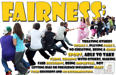
This week we continued to work on our posters. My finished one looks like this:


We also copied down terms off the board, the 6 principles of design.

Balance; Try walking a long distance with a 2 pound bag of rocks in one hand and a 10 pound bag or marbles in the other. After awhile you'll be wanting to shift your load around, putting a few marbles in the rock bag to balance your load, making it easier to walk. This is how balance works in design. Visual balance comes from arranging elements on the page so that not one section is heavier than the other. Or, a designer may intentionally throw elements out of balance to create tension or a certain mood.

Proximity / Unity; Observe a group of people in a room. You can often learn a lot about who is listening intently to another person, which are strangers, or who is ignoring who by how close together they sit or stand. In design, proximity or closeness creates a bond between people and between elements on a page. How close together or far apart elements are placed suggests a relationship (or lack of) between otherwise disparate parts. Unity is also achieved by using a third element to connect distant parts.

Alignment; Can you imagine how difficult it would be to find your car in a crowded parking lot if everyone ignored the parking lot stripes and parked in every which direction and angle? Imagine trying to get out of there! Alignment brings order to chaos, in a parking lot and on a piece of paper. How you align type and graphics on a page and in relation to each other can make your layout easier or more difficult to read, foster familiarity, or bring excitement to a stale design.

Repetition / Consistency; What if stop sign came in pink squares, yellow circles, or green triangles, depending on the changing whims of a town and a few of its residents? Imagine the ensuing traffic jams and accidents. Repeating design elements and consistent use of type and graphics styles within a document shows a reader where to go and helps them navigate your designs and layouts safely.

Contrast; On the basketball court, one pro team looks much like another But send a few of those players for a stroll down most any major city street and something becomes apparent -- those players are much taller than your average guy on the street. That's contrast. In design, big and small elements, black and white text, squares and circles, can all create contrast in design.

White Space; Did you ever participate in that crazy college pasttime of VW Beetle stuffinf? Were you ever the guy on the bottom struggling for a breath of fresh air or the last one in trying to find a place to stick your left elbow so the door will close? It wasn't comfortable, was it? Imagine trying to drive the car under those conditions. Designs that try to cram too much text and graphics onto the page are uncomfortable and may be impossible to read. White space gives your design breathing room.

Monday, February 22

BlogPost for Friday the 19th

This week we contineud to work on our posters. My poster is going to be with the theme, "fairness".

Chapter 13 Questions & Answers:
1. Identify and describe the 6 principles of design.
The 6 principles of design are;
Rhythm - is repitition. Rhythm occurs when a certain element is repeated. Rhythm can add movement to a design, looks like something is happening.
Balance - an impression of steadiness created by placing all the elements of a design in a certain way.
Proportion - the size relationship of one part of a design to another.
Variety - difference; adds interest and excitement to a graphic design.
Emphasis - making one element in a design stand out.
Harmony -the effect achieved when the various elements of a message design work well together.
2. What are the six major styles of type?
The six major styles of type are roman, square serif, sans serif, text, script and novelty.
3. Name the elements of design.
The elements of design are line, shape, form, space, color, texture amd shades of dark and light.
4. What type style is used for the text in most textbooks? Why?
The type style used for text in most textbooks is roman because it's the easiest to read.
5. How is the point size of a typeface determined?
The point size of a typeface is determined through the printer.
6. Name and describe the three kinds of sketches produced during the graphic design process.
Thumbnail layout - small, quick sketches drawn to try out ideas and show how something might look.
Rough layout - contains all the information a printer needs to produce a final product.
comprehensive layout - full color layout that shows how a product will look after it has been printed.
7. Tell the difference between line art and continuous-tone images.
Line art illustrations are made up of solid, dark lines and shapes drawn on a white surface. Continuous -tone images are illustrations composed of varying shades of gray. Black and white photographs are a form of continuous-tone images.

Tuesday, February 9

Blogpost for Friday the 12th

This week in Commtech we are working on a poster.
A poster should;
  • Have large type that can be read from the expected viewing distance (normally 10-15 times your format width).
  • Have a simple layout (select a few key elements - type and visuals - so the viewer quickly gets the message).
  • Include all important information: date, time, place, etc.
  • Have one dominant element - a headline, visual or logotype - that will quickly attract the eye.
  • Have the most important message emphasized by size, color, or value.
  • Have art that is closely related to its message or subject.
  • Have its type and visuals arranged in logical sequence (should read from left to right or top to bottom).
  • Often have unusual or tight croppings on photos (tightly cropped photo can be reproduced larger, so it's easier to see).
  • Have bold, intense colors so it can be easily seen at a distance (poster is meant be seen only at a close range can have more subtle colors).

PRINCIPLES OF DESIGN:

Balance - visual balance comes from arranging elements on the page so that not one section is heavier than the other. Or, a designer may intentionally throw elements out of balance to create tension or a certain mood.

Proximity / Unity - how close together or far apart elements are placed suggests a relationship (or lack of) between otherwise disparate parts. Unity is also achieved by using a third element to connect distant parts.

Alignment - how you align type and graphics on a page and in relation to each other can make your layout easier or more difficult to read, foster familiarity, or bring excitement to a stale design.

Repetition / Consistency - repeating design elements and consistent use of type and graphics styles within a document shows a reader where to go and helps them navigate your designs and layouts safely.

Contrast - in design, big and small elements, black and white text, squares and circles, can all create contrast in design.

White Space - designs that try to cram too much text and graphics onto the page are uncomfortable and may be impossible to read. White space gives your design breathing room.

Friday, February 5

First Friday BLOG post -

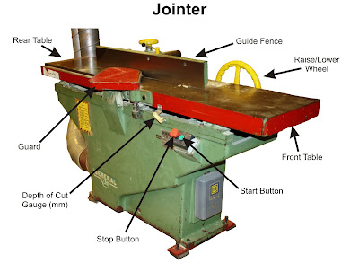
This week in Commtech we made an opinion post on if the web can save paper (below). We also worked on a picture in photoshop. We went to Mr. Vye's construction class and took a picture of a machine that was assigned to us. We then would import it to our computer and edit it in photoshop, making sure we only had the machine. This was the picture of mine;


After we print this our on coral in black & white, and Mr. Vye will label the parts for us. Then we will have to edit the picture again labelling the parts for a good copy.

Monday, February 1

'Can The Web Save Papers' - Opinion Post

I believe putting the newspaper articles on this new device called the iSlate can save papers and would be less harmful to the environment. There are no more stores, no more wasted articles, and less littering.

You don't have to go out to the store in the cold weather or rainy weather. Even during a storm you wouldn't have to worry about going out. Going out means you might get a paper or just miss the last one. You can just open up your iSlate and buy the paper online.

Instead of wasting paper on some of the articles you don't read, like the sports, you can just skip it on your iSlate. Less harmful for the environment again.

The more iSlates mean less papers used to print in factories. Also means less pollution coming from the factories. Instead of people littering their papers on the sidewalks or benches, they'll use their iSlate.

I think this device will save a lot of paper and save the environment more, but should also be concerned about hackers and viruses that may attack
these pages.